

A Kind of Magic

On Music, Design, and the Art of Making Something Unforgettable
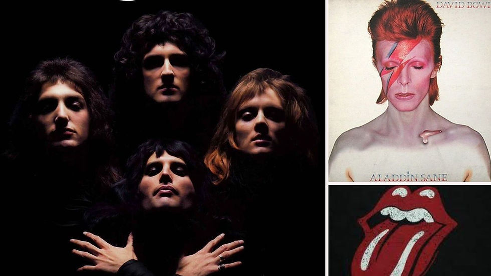
A great song is like a logo. It works on you before you understand why. Neither one explains itself. It just lands, and you spend the rest of the day humming it, or remembering it, or both.
Some of the most legendary musicians in the world understood this without ever being told. They did not just make music. They built entire worlds you could see as clearly as you could hear. It is the same instinct that drives good design and good writing: the right shape, the right word, the right mark, all working to make someone feel something before they have stopped to think about it. And, Freddie Mercury is the brightest proof of all.
Everyone knows him as the voice behind Bohemian Rhapsody, six unruly minutes that broke every rule about what a hit single is supposed to sound like. Ballad, opera, hard rock, pop: four genres that have no business sharing a song, yet here they are, sharing one anyway, and it became one of the greatest songs ever written in the history of humankind.
But what many perhaps don’t know is that Freddie was also a trained graphic designer. And that this is exactly why one of the most recognised logos in music history exists at all: the Queen crest. The crest pulls off the same trick as Bohemian Rhapsody, only visually. Different worlds, one frame, zero apologies.
Freddie studied graphic art and design at Ealing Technical College and School of Art, graduating in 1969. A few years later, he put that training to spectacular use. He wanted a visual identity as grand, regal, and a little provocative as the band name he had chosen. So in 1972, he sat down and sketched a crest fit for royalty. It first appeared as a simple line drawing on the back of Queen's debut album, then exploded into colour on the cover of A Night at the Opera.
The crest is dense with meaning, and none of it is accidental. The zodiac signs of all four band members are folded into it: two lions for Leo (John Deacon and Roger Taylor), a crab for Cancer (Brian May), and two fairies for Virgo (Freddie himself). A crown sits inside the letter Q.
"Is this the real life? Is this just fantasy?" Freddie asked. The crest asks the same question with a smirk. Royal seal, or rock band logo? Why not both?
A phoenix rises behind the whole thing, wings fully spread. Royal heraldry, Greek mythology, astrology, all crammed into one mark, and somehow, despite the visual chaos, it works.
But Freddie was not the only one with this gift.
David Bowie never studied design formally, and yet he lived inside it. He devoured Bauhaus, Japanese theatre, anything visually strange and brilliant, and turned every bit of it into persona. Ziggy Stardust, Aladdin Sane, The Thin White Duke - each one arrived with its own colour palette, its own silhouette, its own way of taking up space in a room. The lightning bolt across his face on the Aladdin Sane cover remains one of the most instantly recognisable images in music, because it does not just look good. It tells you what the music feels like before you have heard a single note of it.
And then, there’s Mick Jagger. The iconic Rolling Stones tongue is often credited to Jagger himself, but the actual designer was John Pasche, then a student at the Royal College of Art. What Jagger handed him was sharper than most briefs ever get: an image of the Hindu goddess Kali, tongue out, and one sentence about the rebellious, larger-than-life attitude the band needed to project. Pasche took that spark and built the logo the entire world now recognises on sight. The version actually trademarked and used on tours and merchandise today was redrawn and finished by Craig Braun's studio in New York, working from Pasche's original sketch. It is proof that a sharp instinct and a skilled hand, working together, can make something neither one could have built alone.
Three different musicians, three different routes to the same place. And once you notice the pattern, it shows up everywhere.
Design and music have more in common than you might think.
A beat that repeats makes a song feel familiar, almost comforting, and the same is true of a colour or shape that repeats across a packaging or a logo. Tempo is pace: a fast song pulls you forward, and good packaging design does the same, controlling exactly how fast or slow someone discovers what is on the shelf. Harmony is cohesion: nothing fighting for attention, everything pulling its weight together. Silence between notes is empty space on a page: both use restraint to make everything else hit harder. And a hook, that one bit of a song stuck in your head for days, is just a strong visual motif wearing a different outfit. Small, repeatable, impossible to shake off.
Good writing, too, runs on the same engine. A short sentence lands like a drumbeat. A long one builds like a bridge before the chorus. The best lines, like the best hooks, usually say the least and mean the most.
But say what you may about music and the genius minds that defined some of the world’s celebrated pieces, there is one more thing worth noticing. None of these musicians worked alone, and the work is better for it. Freddie handed his sketch to printers and art directors who turned it into posters, sleeves, and stage backdrops big enough to fill a stadium. Jagger trusted a designer to take his instinct and run with it. Bowie pulled in photographers, stylists, and filmmakers, building each persona with other people's hands.
Good ideas do not stay in one head. They move between people, pick up speed, and come back better than when they started. A great brand or a great packaging design gets built the same way, through the same coming together of instincts, hands, and resources.
A brand, like a song, is more than how it looks or sounds. It is what it says before it has said a word: what a product pack tells you on a crowded shelf, what a logo announces before the brand behind it has spoken at all. The best logos, like the best songs, take something enormous and compress it into something small enough to fit in your pocket or shopping bag, and impossible to forget.
Freddie Mercury did both, at once, in one lifetime. A voice big enough to fill a stadium, and a hand steady enough to draw the emblem that stadium would carry for the next fifty years.
That is not a coincidence.
That is a kind of magic.
Happy World Music Day. Put on something loud, and don’t forget to take a proper look at the album cover while it plays.


Comments