Organic Tattva
A Packaging System that makes a Flour Range Brand stand out!
Brand Identity + Brand Ecosystem + Packaging


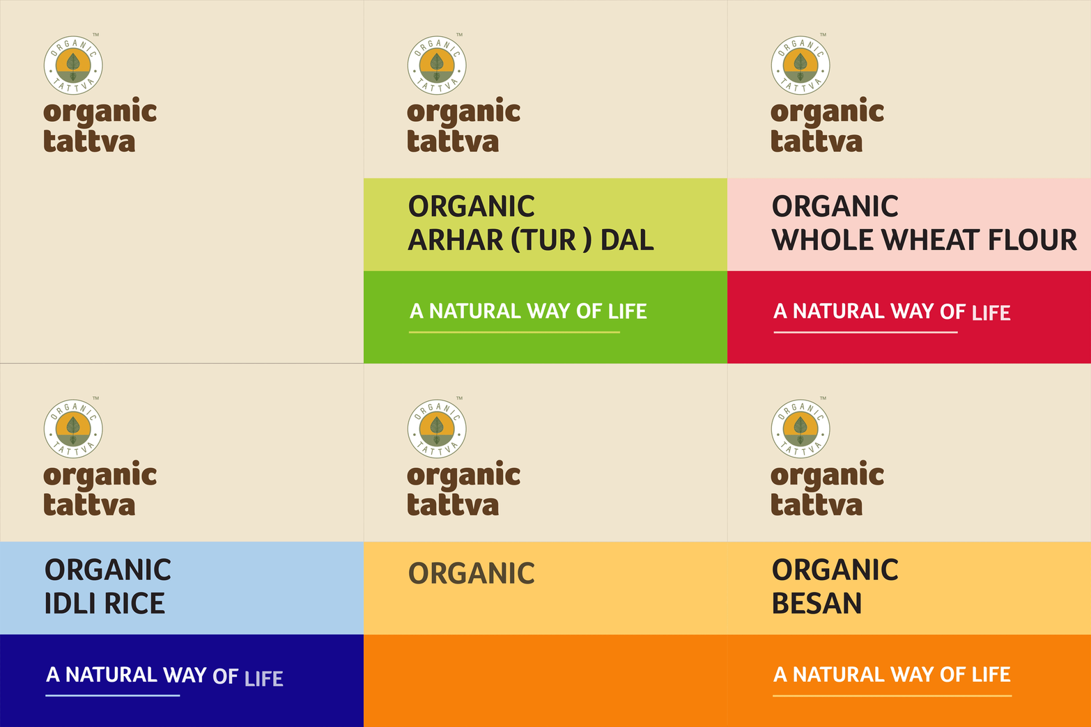
The elaborate yet free flowing packaging system developed for the front and the back of the pack.


Helping an Organic Brand etch itself in the Consumers' Mind!
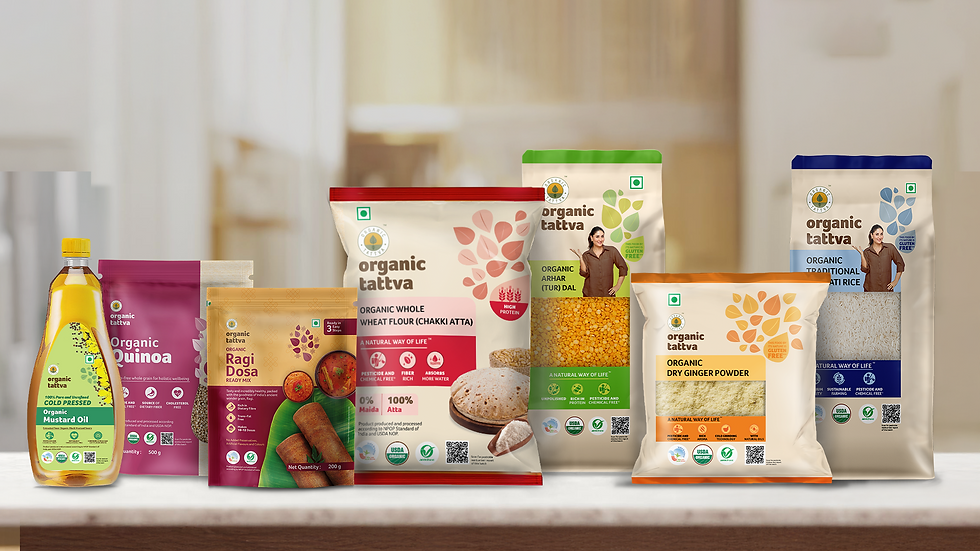
Our collaboration with Organic Tattva has involved revamping the brand’s packaging design for an extensive line of products. The purpose of doing so is to establish Organic Tattva as a responsible brand of authentic organic products and help consumers make a lifestyle shift.
Our on-going synergy with Organic Tattva has led us to design a host of packaging for products such as ready-to-cook meals, masalas, cereals, and super-foods. In the masalas packaging, we carried forward the visual language of leaf graphics and combined it with vibrant background colours. We smartly complemented this with drool-worthy photographs and descriptions of the food.


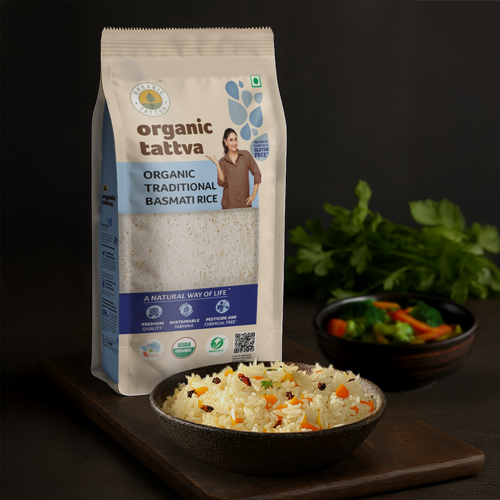
A simple and free flowing, yet eye-catching design language that sets the brand apart!


Bringing Bonco to Life
Add paragraph text. Click “Edit Text” to update the font, size and more. To change and reuse text themes, go to Site Styles.Add paragraph text. Click “Edit Text” to update the font, size and more. To change and reuse text themes, go to Site Styles.Add paragraph text. Click “Edit Text” to update the font, size and more. To change and reuse text themes, go to Site Styles.Add paragraph text. Click “Edit Text” to


DESIGN TEAM
ACCOUNT MANAGEMENT
Rohan Pabale
PRINT PRODUCTION
RESEARCH
COPY WRITING
MARKETING
PHOTOGRAPHY
FOOD STYLING
STRATEGY PARTNERS
PRINT PARTNERS
PACKAGING PARTNERS


