
Better Nutrition
Bringing a New Science-Driven Nutrition Brand to Life
Brand Identity + Brand Ecosystem + Packaging


SCIENCE
NUTRITION
NATURAL
To tell the story of Better Nutrition, we needed a symbol that embodied both science and nature. That's how the 'super seed' was born. Our brand identity brings this seed to life, showcasing the remarkable potential of bio-fortification to nourish lives.


From Seed to System
From a single seed, a powerful visual language emerged. That distinctive shape, the root of Better Nutrition's identity, effortlessly flows through packaging, iconography, and all brand materials. Expanding the seed into a comprehensive system creates a brand experience that feels both organic and consistent, always returning to its central idea: even the smallest element can tell a big story of growth.


By building a scalable packaging system, we enabled Better Nutrition to expand its product line with instantly recognisable packaging that communicates its message. The result is a brand experience that feels authentic and resonates deeply with today's conscious consumers.


Bringing Bonco to Life
Add paragraph text. Click “Edit Text” to update the font, size and more. To change and reuse text themes, go to Site Styles.Add paragraph text. Click “Edit Text” to update the font, size and more. To change and reuse text themes, go to Site Styles.Add paragraph text. Click “Edit Text” to update the font, size and more. To change and reuse text themes, go to Site Styles.Add paragraph text. Click “Edit Text” to


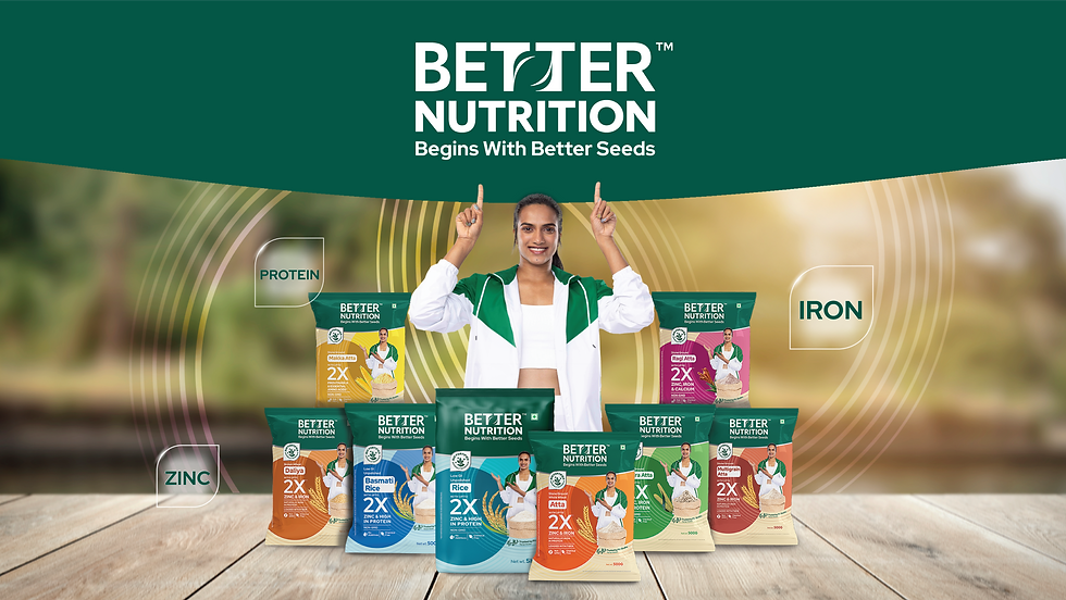
Our work for Better Nutrition brings the brand’s ‘science-meets-nature’ philosophy to life through a thoughtful and immersive visual experience. Drawing on the idea of this synergy, it reveals a ‘super seed’ that symbolises the power of bio-fortification. A rich, trustworthy green evokes purity, while a distinctive seal marks the product’s nutritional edge.
The brand ambassador, P.V. Sindhu, intuitively guides attention to key brand elements, reinforcing credibility and recall. With a strong, consistent brand presence and a visual language built for easy adaptation, the design not only has a great shelf throw but also connects meaningfully with both existing and new consumers.
DESIGN TEAM
Nitin Virkar
Nikita Sawant
Ishwari Bhoskar
Riya Kataria
Tanisha KhardeACCOUNT MANAGEMENT
Dhun Patel
Ketan JoshiPRINT PRODUCTION
Ajinkya Dhage
Hemant SonjeRESEARCH
COPY WRITING
Vikram Sane
MARKETING
PHOTOGRAPHY
FOOD STYLING
STRATEGY PARTNERS
PRINT PARTNERS
PACKAGING PARTNERS

Design with a side of strategy: Building a scalable packaging system for Better Nutrition
We didn't just want to design packaging; we wanted to build a system that could scale with Better Nutrition's ambitions. That's why every element was carefully considered, from the rich green that evokes purity to the distinctive seal that highlights their nutritional edge. And with PV Sindhu as their brand ambassador, we created a visual language that's both trustworthy and engaging, ensuring Better Nutrition stands out and connects with consumers, old and new.