VIAH
An Indulgent Skincare Brand Wows With a Cohesive Identity and Packaging System
BRAND STRATEGY +
BRAND ECOSYSTEM +
PACKAGING DESIGN


DESIGNED FOR IMPACT
250%-300%
M-o-M growth
10x Sales
than predicted
40% Repeat
customer rate per month


“Winning the India Best Design Award is a testament to the exceptional work Therefore Design has done on Viah Beauty’s packaging. Their ability to translate our branding and packaging vision has not only elevated Viah Beauty’s presence in the market but also set a new standard for premium skincare.”
The making of Viah
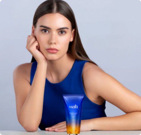
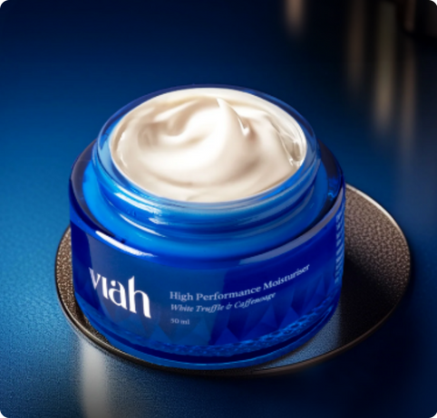
True to the idea of ‘keeping it real’, we created a design language that prioritises user clarity. We created functional and effective product names, complemented with straightforward product explanations. We crafted the identity to be plush and minimal, ticking all the right indulgence boxes. The Viah wordmark comes alive in all its grandeur in the Hugolers Stylish font, effortlessly evoking feelings of luxury and panache.


ASKING THE RIGHT QUESTIONS. AT THE RIGHT TIME.
Building the brand, from strategy to system

Our smart design system addresses the challenge of making Viah appealing to consumers in an already cluttered category market where a new skincare brand launches almost every waking moment. The brand had to look different, premium and dependable, while helping consumers pick what’s right for them.
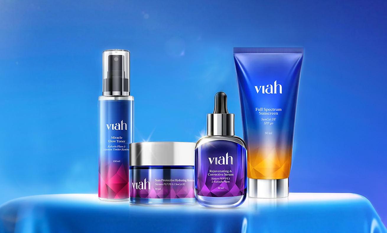
We created a deep and rich colour palette comprising the Viah Blue and the Viah Gradient that lends a sense of regal luxury to the brand. Inspired by the vibrancy of gemstones, we developed colours for the packaging that complement the Viah gradient. These colours - green, purple, red and yellow also act as differentiators across product categories for better consumer recall.
CURATING A SEAMLESS EXPERIENCE
Keeping it modern and minimal
Inspired by the facets and beautiful cuts of gemstones, particularly the reflection and refraction of light through a gem’s faceted walls, our graphics for Viah create an array of mesmerising colours. They exude a sense of charm and prestige, indicating the products are refined and crafted to perfection. Used on the packaging, they enable a seamless transition between the brand identity colours and the packaging colours, and complement the Viah gradient.

RECOGNITION
CLIENT
VCB-VIBE CUSTOMIZED BEAUTY PVT. LTD
INDUSRTY
BEAUTY AND SKINCARE
SERVICES
BRAND ARCHITECTURE + BRAND IDENTITY + BRAND IDENTITY SYSTEMS + VISUAL LANGUAGE DESIGN
CREDITS
Design Team
Gauri Barve Kale
Akanksha Salvi
Nikita Sawant
Vaishnavi Ladkat
Account Management
Rohan Pabale
Artwork Team
Akshay Shivmare
Research, Narrative & Strategy
Photography/ Video
NA
Food Styling
NA
Strategy Partners
CherryPeachPlum
Print Partners
NA
Packaging Partners
NA
NA
Digital Team
NA
Copy
Chaitra Patel
MORE PROJECTS


