BONCO
A Legacy Brand Makes a Chocolate Debut with a Heartwarming Design System
BRAND STRATEGY +
BRAND ECOSYSTEM +
PACKAGING DESIGN


DESIGNED FOR IMPACT
30% Higher
packaging recall
8/10 Shoppers
recognised Bonco on shelf
70% Buyers
perceived product purity & authenticity


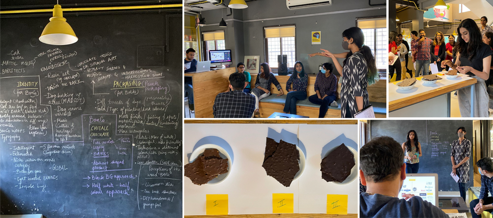
Bonco’s story began with meticulous research, followed by strategy and innovative design. Our market research had revealed a polarised chocolate market - premium brands focused on origin and quality, while mass-market players emphasised emotional appeal. We identified an opportunity for pure chocolate at an accessible premium price, and validated it through a SWOT analysis! Brainstorming led us to three key narratives, which we refined using moodboards, color palettes, and visual inspirations. Ultimately, we chose ‘Better for You’, which evolved into Bonco’s core brand essence.
Bringing Bonco to Life
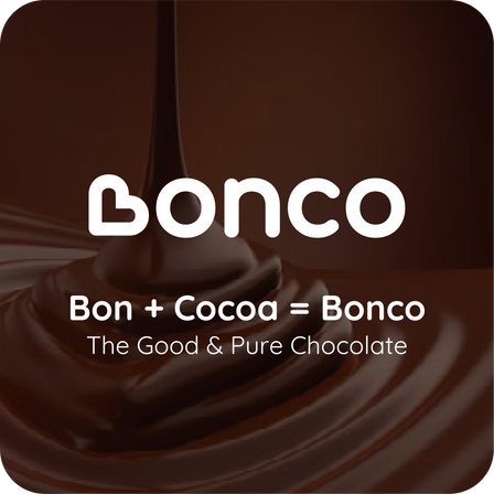
The brand values we crafted for Bonco - ‘passion for value’, ‘honest at heart’, and ‘innovation for you’, led us to develop a timeless brand essence - Pure Chocolate, Pure Heart. Inspired by this essence, we created a playful fusion of ‘Bon’, which is French for ‘good’ and ‘Co’, for cocoa. The result…Bonco emphasises how good a chocolate it truly is!
For the identity, Bonco had to look like what it sounds! Our identity ‘speaks to the heart’. It’s balanced yet exudes a bit of quirk, and feels wholesome, as it incorporates a heart for the ‘B’ of Bonco. Its roundness and free-flowing form indicate a circle of trust and purity.


ASKING THE RIGHT QUESTIONS. AT THE RIGHT TIME.
Building the brand, from strategy to system

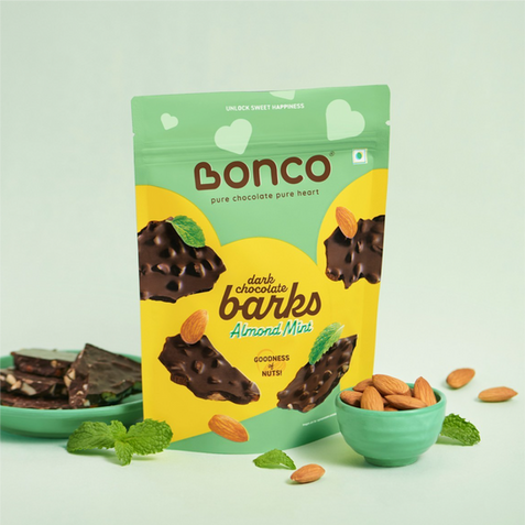
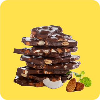
Our design for Bonco celebrates the purity and goodness of chocolate by drawing deep inspiration from nature — raw terrains that are inherently uneven yet strikingly pure and unique. This idea comes alive through the packaging, where jagged, bark-like chocolate pieces are showcased in their most natural, yet irresistible form.
But the story doesn’t stop there. The brand language flows quite literally across every touchpoint - from palette to packaging. At the heart of it lies a simple story of purity, translated thoughtfully through design. Delicate yellow hearts and smaller visual cues carry the emotion forward, while the lightness of the barks is captured through airy, natural photography. The hallmark of Bonco lay in the delight evoked by its name — and we needed a typeface that captured that very feeling. We recognised the subtle yet powerful connection between a word as simple as ‘Bonco’ and the emotion it could stir through its letters, form, and sound.
CURATING A SEAMLESS EXPERIENCE
A bean-to-heart story
A great story never fails to captivate. So, we chose to tell a story for Bonco. First, we explored the heart shape and came up with ways to showcase it across our design. We used large hearts on the front of the pack, complemented with smaller ones. We used the back of the pack to tell Bonco’s ingredient story from ‘Bean to Heart’ in a fun and engaging manner. The mandatories, too, found a place of their own on the back of the pack. A precise photography brief finally brought the design to life.
But we knew the back of the pack needed more than just information — it needed soul. Simply repeating images and text wouldn’t do justice to the narrative we were building. So we brought the 'Bean to Heart' story to life through an illustrated seal that subtly reinforces Bonco’s promise of purity and honesty. Then we wove the ingredient story in thoughtfully, with visual elements that not only inform but also invite curiosity. We designed each detail to delight — building trust while keeping the storytelling alive, right down to the last panel.

RECOGNITION
CLIENT
CHITALE
INDUSRTY
FOOD AND BEVERAGES
SERVICES
NAMING + BRAND IDENTITY + PACKAGING DESIGN
CREDITS
Design Team
Gauri Barve Kale
Vrushal Shah
Shreya Joshi
Ishwari Bhoskar
Account Management
Ketan Joshi
Artwork Team
Ajinkya Dhage
Research, Narrative & Strategy
Photography/ Video
Food Styling
Strategy Partners
NA
Print Partners
NA
Packaging Partners
NA
Digital Team
Copy
Vikram Sane
MORE PROJECTS


